Mercury – Building trust in Treasury
Mercury is the complete financial stack for startups, offering checking/savings accounts, corporate card and spend management, invoicing, AR/AP and more.
Treasury is a unique Mercury account where founders can invest idle cash into high-yield investment accounts to earn up to 5.42% annually. Only startups that have over $500k in their checking accounts are eligible, making it a premium product for larger, more valuable customers.
Problem
🚨
Customers had no visibility into the way our yield calculations and fees work, leading them to distrust Treasury
Hundreds of customers inquired about this during my term, with one calling it the “worst financial reporting I’ve ever seen”.
Solution & Key Design Decisions
Prototype
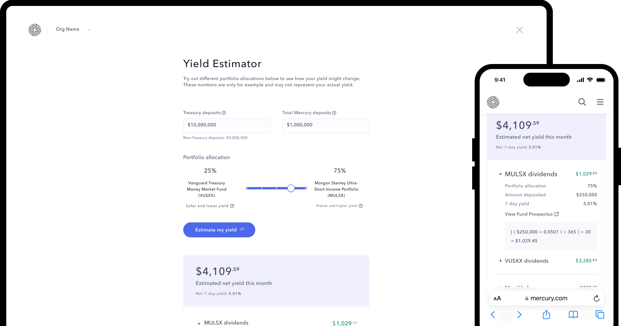
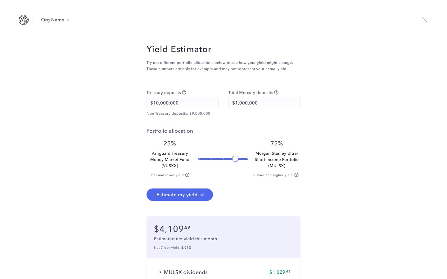
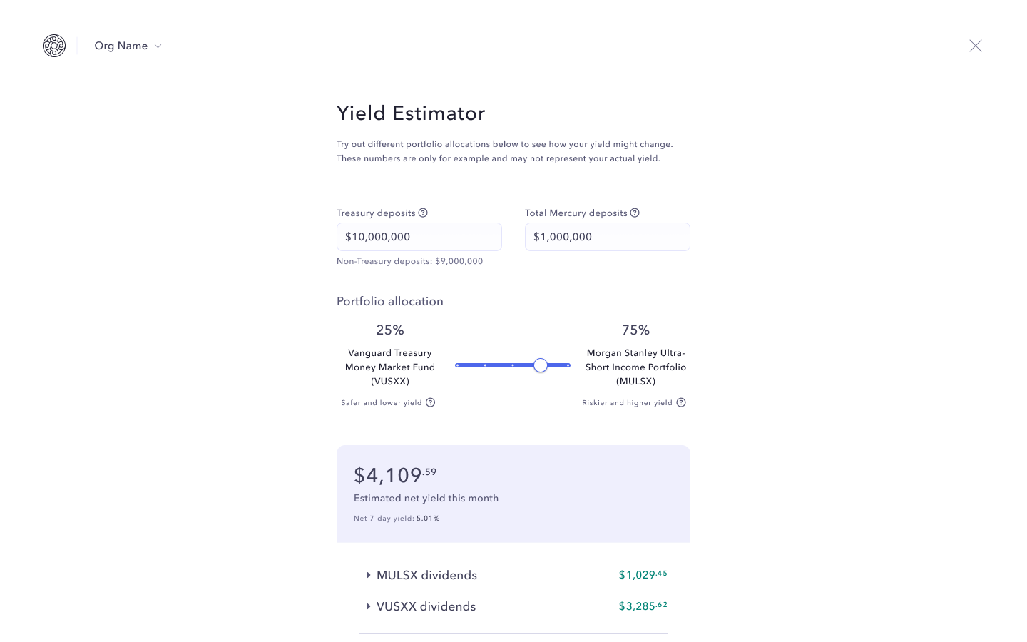
1. Visualizing the yield calculation
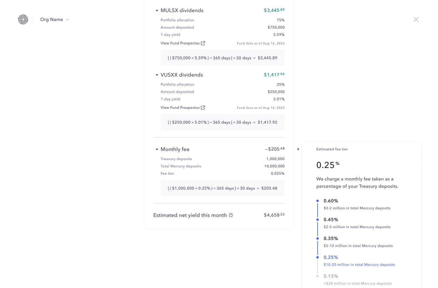
Visualizing the net yield calculation seemed like a no-brainer since it was the main thing customers were confused about. However, there were some tradeoffs to consider:
- The equations took up lots of screen space, appearing long and daunting
- Equations weren't a part of design system and required extra FE development
- The fee tier was still a confusing concept that visual calculations alone wouldn't solve.
🔨
Final decision: explicitly surface the calculations like a receipt and nest them in dropdowns closed by default so that customers can learn more without being greeted with everything all at once.
2. Auto-updating results vs. updating on CTA click
What if somebody wanted to predict their yield consecutive times with different inputs? Should the results auto-update with every single input change, or should it update after the a CTA click?
🔨
Final decision: auto-populate results on the first time visit to the page using the user's data to reduce mental load from recall.
Any changes to inputs afterwards will require clicking the CTA, giving users control and providing visual hierarchy and direction.
3. Showing varied risk across portfolio compositions
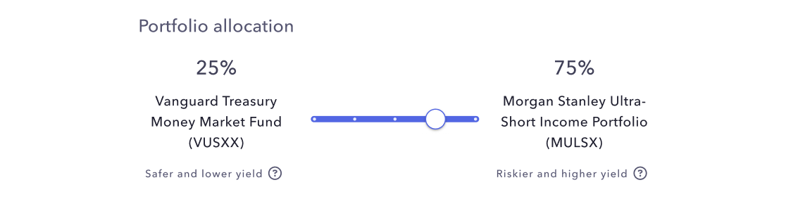
The ability to change portfolio allocation and view the impact on one's net yield is convenient, but users need to know the relative risk of different allocations.
Treasury invests in two funds, one of them being slightly riskier and thus having higher yield – to design ethically, users have to be educated on the risks and so that they're not blindly following the option that nets them higher yield.
🔨
Final decision: a new slider component to easily toggle portfolio allocation, and statements like “safer and lower yield” to make it clear what people are getting themselves into.
4. Design file organization
File organization is vital for high-caliber engineering <> design collaboration, and this was emphasized at Mercury. You can take a peek at how I organized my file for clarity and efficiency with FE engineers.
Success metrics
- Decrease in number of Customer Support tickets related to Treasury fees and yield
- Retention of customers who used the yield estimator vs those who haven’t
- Increase in Treasury deposits of customers who used the yield estimator vs those who haven’t